Designing dark-mode dashboards that don't feel heavy
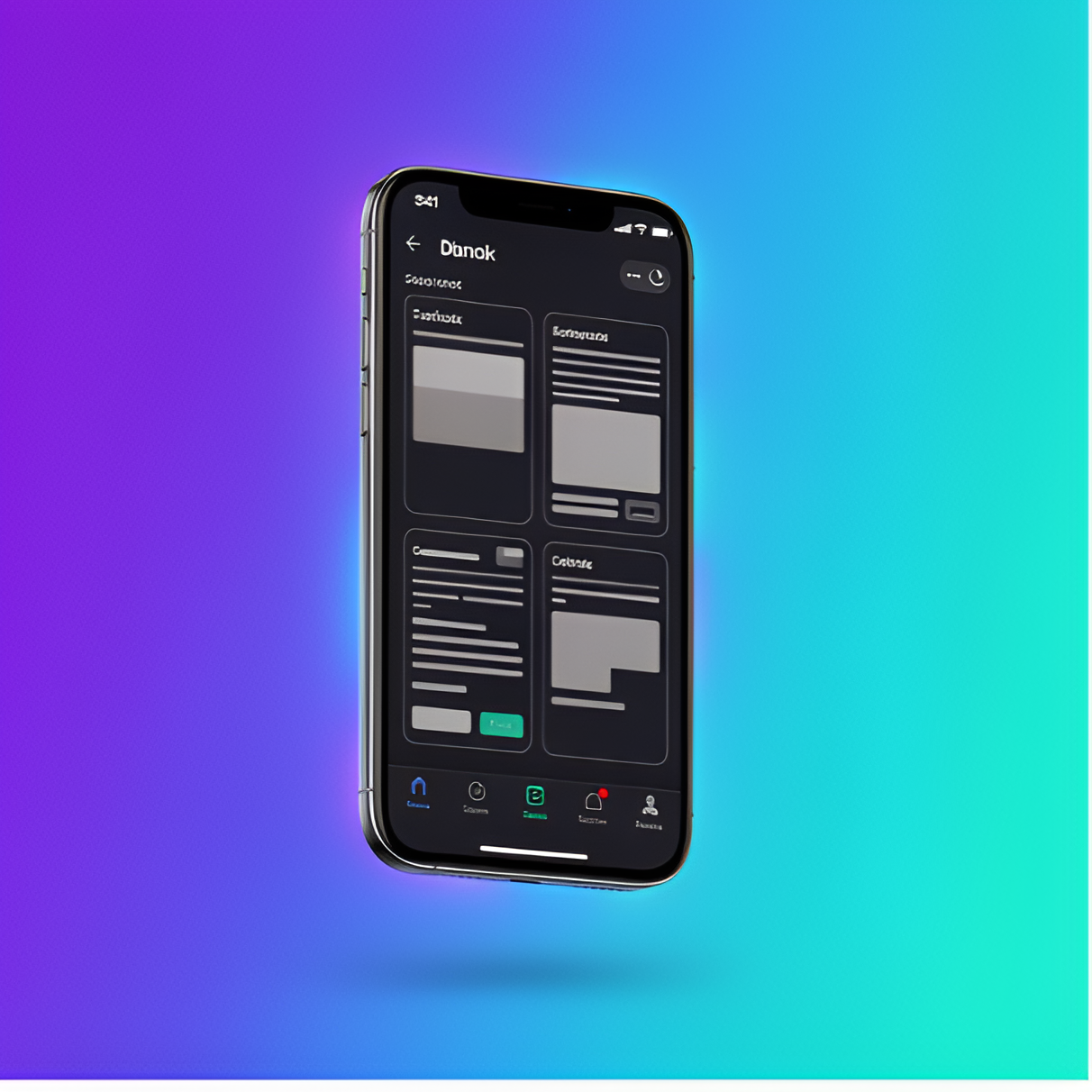
Dark mode done wrong crushes interfaces under the weight of pure black. Here's the system we use to build dark UIs that breathe.
Engineering insights, design patterns, and lessons from the build process. Technical depth without the noise.
Dark mode done wrong crushes interfaces under the weight of pure black. Here's the system we use to build dark UIs that breathe.
Retention is a design problem, not a marketing problem. The decisions in Planner that drove week-over-week engagement.
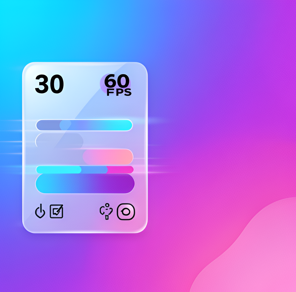
Every dropped frame is a broken promise to the user. How we optimise React Native apps to hit 60fps on mid-range devices.

Progressive Web Apps have matured. The architecture pattern we use to ship PWAs that pass the native app smell test.
Explored a layered approach to dark UI that avoids heavy black backgrounds, using surface tokens and controlled contrast ratios.
Deep-dived into the design decisions that separate habit apps with 30% week-2 retention from ones with 8%.
Documented the techniques that moved our apps from 40fps to a consistent 60fps on lower-end Android devices.
Service workers, background sync, and the Web App Manifest patterns that make PWAs feel indistinguishable from native apps.