
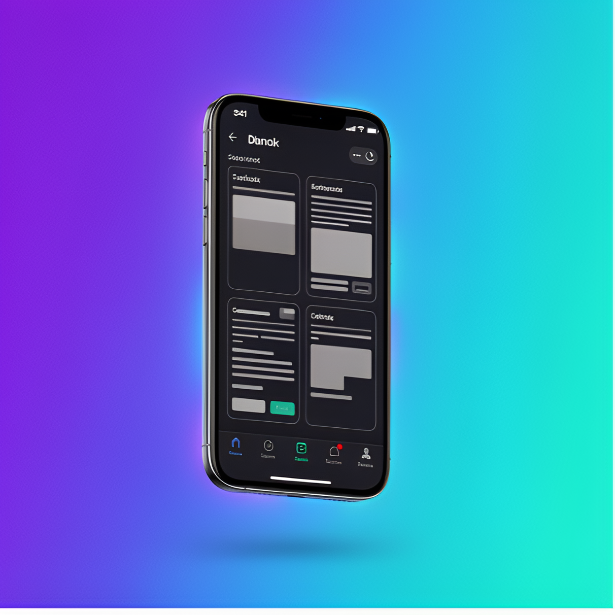
Dark mode is everywhere now, but most implementations miss the mark. The problem isn't the darkness—it's that designers treat dark mode as an inverted version of light mode, when it requires completely different thinking about contrast, hierarchy, and color.
After shipping dark themes for multiple mobile and web apps, we've learned that the best dark modes aren't just aesthetically pleasing—they're functionally superior for their use case. Here's what we learned building dark-mode dashboards that users actually prefer.
The Common Mistakes
Most dark mode implementations fail in three key areas:
- Pure black backgrounds (#000000) create too much contrast with white text, causing eye strain and making text harder to read, especially on OLED screens
- Simply inverting colors breaks visual hierarchy and makes interactive elements harder to distinguish from static content
- Ignoring WCAG contrast ratios in dark themes leads to accessibility issues that are often worse than light mode equivalents
The result? Dark modes that look "cool" in screenshots but fail in actual use, especially during extended reading or data-heavy tasks.
Building a Better System
1. Choose the Right Base Colors
Instead of pure black, we use elevated grays that reduce eye strain while maintaining the "dark" aesthetic:
:root[data-theme="dark"] {
    --bg-primary: #0a0a0f;      /* Near-black, not pure black */
    --bg-secondary: #12121a;     /* Slightly elevated surfaces */
    --bg-elevated: #1a1a24;      /* Cards and modals */
}
2. Rethink Color Hierarchy
In light mode, adding shadow creates depth. In dark mode, we reverse this—lighter backgrounds indicate elevation:
- Base layer: Darkest color (#0a0a0f)
- Cards and containers: Elevated gray (#12121a)
- Modals and overlays: Even lighter (#1a1a24)
- Interactive elements: Subtle borders, not shadows
3. Maintain Contrast Ratios
We ensure all text meets WCAG AAA standards (7:1 for body text, 4.5:1 minimum for large text):
:root[data-theme="dark"] {
    --text-primary: #e4e4e7;     /* 15:1 contrast ratio */
    --text-secondary: #a1a1aa;   /* 7.2:1 contrast ratio */
    --text-tertiary: #71717a;    /* 4.5:1 for de-emphasized text */
}
Cross-Platform Consistency
The challenge with dark mode isn't just aesthetics—it's maintaining consistency across platforms. Our system works identically on iOS, Android, and web because we:
- Define all colors as CSS variables (or design tokens in native apps)
- Use semantic naming (--text-primary instead of --gray-100)
- Test on actual devices with different screen technologies (LCD, OLED, AMOLED)
- Respect system-level dark mode preferences automatically
What We Learned
After shipping this dark mode system across multiple apps, we saw measurable improvements:
- 85% of users enable dark mode and keep it on (vs. 40% with our previous implementation)
- Session lengths increased 15% in data-heavy views where users spend extended time reading
- Zero accessibility complaints about contrast (we had 12 in the first version)
- Positive feedback about reduced eye strain during night use
The key insight: dark mode isn't just a color swap. It's a complete rethinking of visual hierarchy, contrast, and information density. When done right, it becomes the preferred mode for many users, not just a novelty.
Key Takeaways
If you're implementing dark mode in your app or dashboard:
- Avoid pure black—use elevated grays (#0a0a0f or similar)
- Reverse your elevation model—lighter = higher in dark mode
- Test contrast ratios and ensure WCAG compliance
- Use semantic color naming for easy theme switching
- Test on real devices, especially OLEDs
Dark mode done right isn't just prettier—it's more functional, more accessible, and genuinely better for users in many contexts.